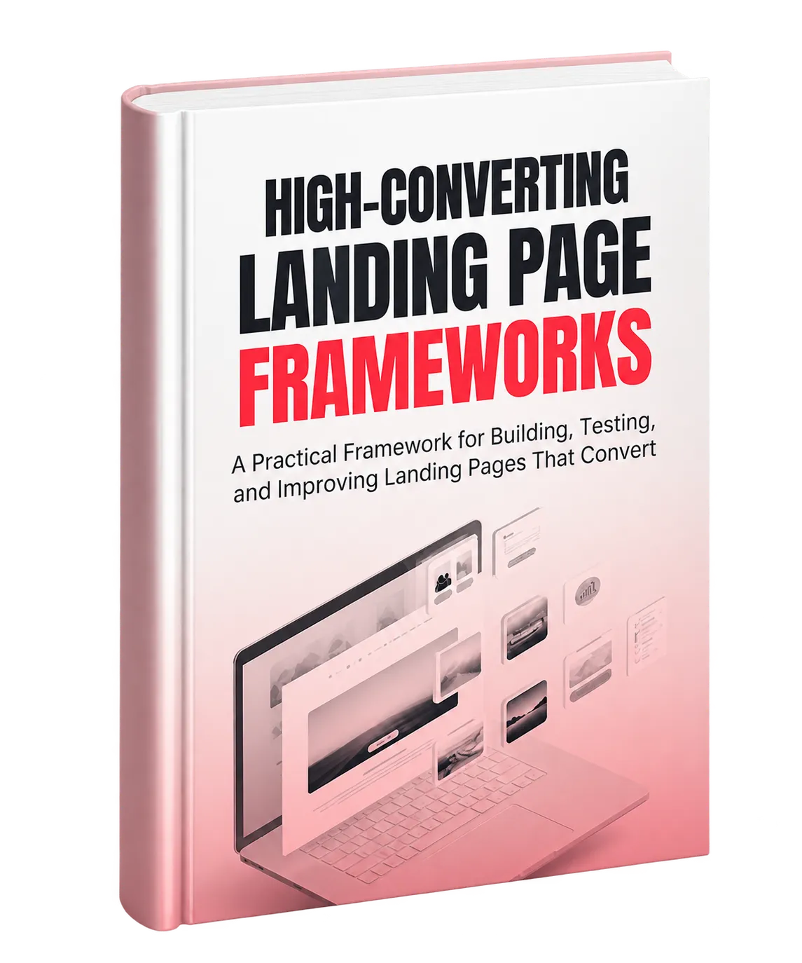
A Systematic Approach to High-Converting Landing Pages
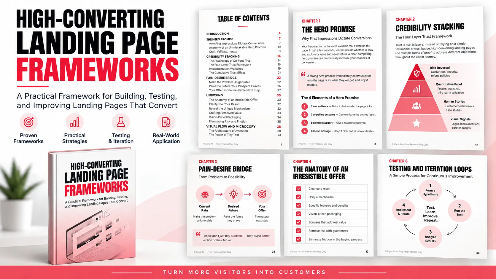
A landing page should not depend on a clever headline, an attractive design, or a collection of conversion tactics assembled independently. The central approach in this framework is to treat conversion as a sequence. Each part of the page has a specific job, and each should support what comes before and after it.
The framework moves through the visitor journey from initial attention to trust, emotional relevance, offer evaluation, action, and continuous optimization. This creates a practical structure for both building new landing pages and diagnosing pages that are already receiving traffic.
1. Start With a Clear Hero Promise
The hero promise is the customer-focused statement visitors encounter at the beginning of the page. Instead of simply announcing what a company or product does, it should communicate an outcome that matters to the intended visitor.
A strong hero promise answers four fundamental questions:
- Who is it for? Make the intended audience recognizable.
- What do they get? Communicate the desired outcome or transformation.
- Why should they trust you? Support the promise with appropriate credibility.
- Can the message remain clear and brief? Remove language that makes the promise harder to process.
Specificity strengthens the promise. Concrete outcomes, meaningful numbers, timeframes, or transformation language can make an abstract benefit easier to understand. The supporting subhead can then clarify the promise, add another benefit, address an important objection, or prepare the visitor for what comes next.
Use Customer Language to Develop the Promise
Creating the hero promise should be an iterative process rather than a one-time brainstorming exercise. Begin by mining customer feedback, testimonials, support tickets, reviews, and sales conversations for language customers already use to describe their problems and desired outcomes.
From that material, generate multiple headline variations. Explore different benefits, pain points, and audience angles before narrowing the options. Rapid tests, such as short recall tests or small headline experiments, can then help determine which messages make the strongest impression.
Avoid feature-first language, vague hype, and messaging so broad that the intended customer cannot immediately recognize themselves.
2. Build Trust Through Credibility Stacking
Attention does not automatically create trust. Once the hero promise establishes relevance, the next task is reducing uncertainty around whether the visitor should believe it.
The credibility stacking framework organizes proof into progressive layers rather than scattering testimonials and trust elements randomly across the page.
Layer 1: Visual Signals
Place immediately recognizable credibility indicators near the initial promise. Relevant customer logos, media mentions, partner badges, and similar visual signals can establish an initial association with trusted organizations without requiring extensive reading.
Layer 2: Human Stories
Follow initial credibility signals with proof from people whose situation resembles that of the prospect. Strong testimonials communicate the starting point, the specific challenge, and the result rather than offering generic praise.
The purpose is not simply to show that somebody liked the product. It is to help visitors recognize a situation similar to their own and see evidence of a meaningful transformation.
Layer 3: Quantitative and Authority Proof
As visitors move into deeper evaluation, reinforce credibility with appropriate data, success metrics, comparisons, or third-party validation. These elements provide more rational support for the claims introduced earlier.
Layer 4: Risk Reversal
Near the point of action, address the fear of making the wrong decision. Depending on the offer, this can include clear guarantees, security information, refund or cancellation policies, privacy information, and other assurances relevant to the commitment being requested.
Gather, Filter, and Place Your Proof
A useful credibility stack begins by gathering available evidence from more than formal testimonials. Customer conversations, social comments, industry mentions, partner material, and other authentic sources may contain valuable proof.
Filter those assets based on whether they answer a genuine objection, contain useful specifics, and remain believable. Then place each proof element where the corresponding doubt is most likely to arise. The goal is cumulative trust, not the maximum possible amount of proof in one section.
3. Connect Pain to Desire
After establishing relevance and credibility, the page needs to demonstrate that it understands the visitor's current situation and the outcome they want.
The pain-desire bridge provides this emotional progression. It begins with the current problem, makes the consequences easier to understand, introduces a believable future state, and then connects that desired state to the offer.
Create an Empathy Snapshot
An empathy snapshot is a concise description of the prospect's present reality. Its language should come from genuine customer research whenever possible rather than marketing terminology.
Specificity matters. Instead of presenting a broad collection of generic problems, identify details that help the visitor recognize their own experience. Customer service conversations, onboarding responses, interviews, and social comments can provide useful language for this section.
Make the Cost of Inaction Concrete
Where the underlying problem has measurable consequences, quantify them. A cost-of-inaction calculation can translate a vague concern into lost revenue, wasted time, missed opportunities, or another relevant consequence.
The purpose is to demonstrate why the problem matters rather than merely stating that it exists.
Show a Believable Future State
Once the current situation is clear, shift the page toward what could change. Describe the desired outcome with enough specificity that visitors can picture the difference between their current and future state.
Effective vision sections combine rational benefits, such as time saved, money earned, or problems solved, with emotional benefits such as reduced stress or increased confidence. The desired outcome should be meaningful enough to motivate action while remaining believable.
Bridge Naturally Into the Solution
The transition from problem and desire to the offer should explain why the solution is a logical response to the situation already described. Connect the specific problem, the desired outcome, the product or service, its mechanism, and the resulting benefit.
Where appropriate, a lower-risk action such as a quiz, calculator, demonstration, or similar micro-commitment can help visitors build momentum before encountering the primary call to action.
4. Unbox the Offer Around Customer Value
Visitors frequently scan landing pages rather than reading every word. That makes the presentation of an offer almost as important as the offer itself.
Offer unboxing turns a collection of features into a structured explanation of what the customer receives and why it matters.
Four Elements of a Strong Offer
- Core result: The main change or outcome the customer receives.
- Unique process: The mechanism or approach used to produce that outcome.
- Experience: What using or working with the solution is like.
- Proof: Evidence supporting the offer and its claims.
Lead with the result before explaining implementation details. When describing individual features, repeatedly ask what each feature means for the customer. Translate functionality into practical benefits rather than expecting visitors to make that connection themselves.
Clarify the Core Result
The core result should reconnect the offer with the promise and pain established earlier. Use specific outcomes when they can be legitimately supported, and consider combining what the visitor gains with the frustration or cost they can avoid.
Explain the Unique Mechanism
The mechanism explains why the solution works differently. It could be a process, methodology, tool, sequence, or combination of established elements. It does not need to be complicated. It needs to make the approach understandable and distinguish it from alternatives.
Build Perceived Value Without Adding Random Extras
Additional components or bonuses should remove specific obstacles, answer objections, or make implementation easier. They work best when they extend the core offer naturally rather than existing only to make the package appear larger.
Present the complete value before asking the visitor to judge the price. For complex offers, visually organizing components into stages or milestones can also make the path from purchase to outcome easier to understand.
Remove Risk and Friction
Interest can still fail to produce action when the final step feels uncertain, complicated, or risky. Make pricing structures and potential costs clear. Use specific guarantees where appropriate, and only use scarcity or urgency when it reflects a genuine limitation or deadline.
Lower-risk commitments such as trials or samples can allow visitors to experience some value before making a larger commitment. The primary CTA should then follow naturally from the value presented and the risk removed.
5. Use Visual Flow and Microcopy to Guide Decisions
Strong copy cannot perform effectively if visitors cannot find or process it. Visual hierarchy determines what receives attention first, while microcopy helps resolve hesitation around individual interactions.
Design Around Scanning Behavior
Use hierarchy to establish a clear sequence of attention. Important promises should receive greater visual emphasis than supporting information, while high-contrast treatments should be reserved for primary actions and critical highlights.
Position, whitespace, size, and selective motion can all influence where attention goes. Whitespace should be treated as part of the communication system rather than unused space. It can isolate important messages, testimonials, and calls to action from competing elements.
Directional cues should also support the intended path through the page rather than draw attention away from key messages.
Use Microcopy at Moments of Hesitation
Microcopy includes button labels, form instructions, field hints, error messages, confirmations, tooltips, and small reassurance messages. These pieces of text appear at moments when visitors are deciding whether to continue.
Effective microcopy responds to the visitor's likely state of mind. If they are uncertain, provide reassurance. If the perceived effort may be high, clarify the commitment. If privacy is a concern, address it near the relevant field. If an error occurs, explain clearly how to correct it.
CTA language should communicate an action and the benefit or low-risk nature of taking that action rather than relying solely on generic labels.
Reduce Perceived Effort
Use progressive disclosure to avoid presenting more information than a visitor needs at a particular stage. Longer explanations can appear deeper in the page after the visitor has demonstrated interest, while earlier sections remain concise and easy to scan.
On mobile, compress copy into smaller blocks, preserve visual clarity, and position actions where they remain convenient to reach.
6. Build Testing and Iteration Into the Landing Page Process
A landing page should not be treated as finished at launch. The framework treats conversion optimization as an ongoing cycle of measurement, experimentation, learning, and refinement.
Establish a Conversion Baseline
Before making changes, decide what success means and measure current performance. Choose a primary conversion metric and support it with metrics that reveal how visitors move through the page.
Useful measurements can include:
- Overall conversion rate
- Bounce rate
- Scroll depth
- Time on page
- CTA click-through rate
Tracking should be established before experimentation so changes can be compared against a meaningful baseline.
Form Testable Hypotheses
Experiments should begin with a reasoned hypothesis rather than a random design preference. A useful structure is:
If we implement a specific change, then a target metric should improve because of an identified conversion principle.
This connects every test to a particular problem and creates a basis for learning even when a variation does not win.
Use a Lean Testing Loop
- Develop the hypothesis from available data rather than a hunch.
- Set up the experiment and verify that it works correctly.
- Allow the test to reach the predetermined statistical threshold.
- Analyze both successful and unsuccessful variations for insight.
- Implement validated improvements and document what was learned.
Prioritization can also be structured around expected impact, confidence, and ease. Sites with less traffic should generally focus experiments on larger conversion levers before testing minor details.
Combine Quantitative and Qualitative Evidence
Metrics reveal where a problem exists, but they may not explain why. Heatmaps, session recordings, polls, exit surveys, customer interviews, reviews, and support conversations can reveal hesitation, confusion, objections, and customer language that analytics alone cannot capture.
Use the two forms of evidence together. Quantitative information identifies patterns in behavior, while qualitative research can help explain the causes behind those patterns and inspire the next experiment.
7. Turn the Framework Into an Operating Process
The individual components are most useful when treated as an interconnected system. A strong promise unsupported by credibility can create doubt. A compelling offer without an effective pain-desire bridge may lack context. Strong copy hidden by weak visual hierarchy may never receive enough attention.
The framework therefore follows a deliberate progression:
- Establish the hero promise.
- Build credibility.
- Connect pain with desire.
- Unbox and clarify the offer.
- Guide attention and reduce friction through visual flow and microcopy.
- Measure, test, learn, and iterate.
Adapt the Depth, Not the Logic
The framework can be adjusted for different contexts. Mobile experiences require greater compression than desktop. Cold visitors may need more immediate credibility, while familiar visitors may require less. Social traffic may need more problem awareness before the offer, while search visitors may arrive with clearer intent.
The depth and emphasis can change, but the overall logic should remain coherent from promise through action and optimization.
A Practical Pre-Launch Review
Before launching a landing page, review the complete journey:
- Does the hero promise clearly communicate what the visitor wants?
- Can visitors see relevant credibility evidence early?
- Does the pain-desire section reflect real customer language?
- Is the offer's value understandable before the price is evaluated?
- Does the visual hierarchy direct attention toward the primary action?
- Does microcopy address friction around important decisions?
- Is tracking ready to measure what happens after launch?
Move From Launch to Continuous Improvement
Once the page is live, optimization becomes a repeating cycle: establish the baseline, test a hypothesis, learn from the results, implement validated changes, and establish a new baseline.
A systematic approach also helps prevent common mistakes such as chasing unrelated growth tactics, making changes without tracking, allowing acquisition messages and landing-page promises to drift apart, or stopping optimization after an early improvement.
The ultimate purpose of the framework is not to produce a single supposedly perfect landing page. It is to create a repeatable way to understand what each part of the page is meant to accomplish, identify where the conversion journey is breaking down, and improve it through disciplined testing.